


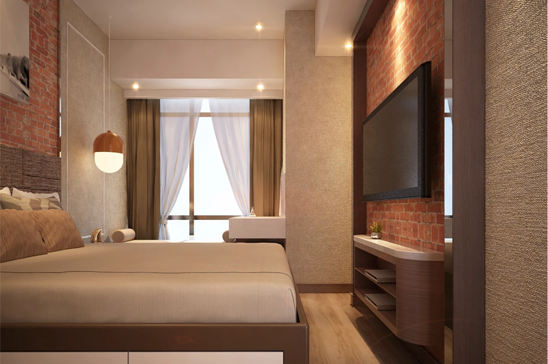
Ever wonder why you feel instantly relaxed in a luxury spa resort but energized in a trendy boutique hotel? It isn’t just the service; it’s the science of Color Psychology. In the hospitality industry, interior design is a silent language that speaks directly to a guest's subconscious.
Warm tones like terracotta and gold are often used in lobby areas to create a sense of security and "home." Conversely, high-end brands often lean into "cool luxury"—using deep blues and emerald greens to signal sophistication and calmness. Even the crisp white linens in hotel rooms aren't just for cleanliness; white represents a "mental reset," allowing travelers to feel that their space is a blank canvas, free from the clutter of their journey. For aspiring hoteliers at IIMS Kochi, understanding that a room is a physical manifestation of an emotion is the first step toward mastering guest experience